Posts Tagged ‘Information Design’
Information visualization provides a way of helping people make sense of large, complex data sets, such as the following:
- Topology data
- Epidemiology data
- Sets of time series
- Medical data
- Geographic maps
- Network connections
- Financial data
- U.S. Government Budget
- Billions of customer transactions
- Radiation doses and their impact over time
Improving large-scale analysis of these and many other massive data sets presents an ongoing challenge for businesses, academia and government. Using information visualization techniques, however, allows us to explore visually and perhaps arrive at some understanding of patterns and groupings that might otherwise remain invisible.
Essentially, information visualization allows you to extract meaningful information from a sea of data.
And those data do not have to correspond only to the physical and concrete. They can be abstract, drawn from the domains of the symbolic, the textual, the logical, the tabular, the networked, and the hierarchical, among others.
(blank)
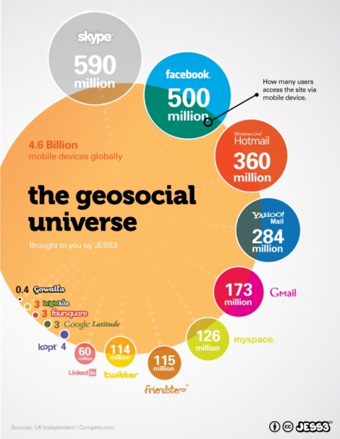
Example: Accessing the Geosocial Universe via Mobile Devices
How popular are the various geosocial networks with mobile users? This infographic is a good example of “compare and contrast.”

This infographic illustrates and compares the popularity of different geosocial networking services. (Click to see credits and source.)
(blank)
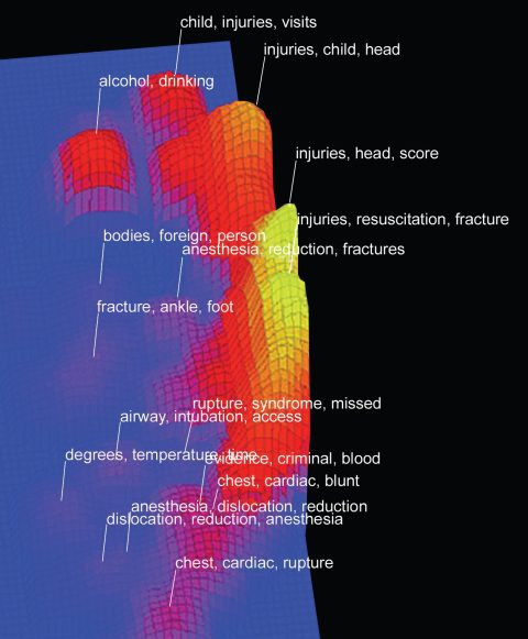
Example: Ranking Themes in Documents
If you’re curious about the relationships among documents, this visualization shows clusters of themes and their strengths in health- and medical-related literature.

This ThemeView Landscape figure shows relationships among documents. High peaks represent prominent themes. Peaks close together represent clusters of similar documents. (Click to see credits and source.)
(blank)
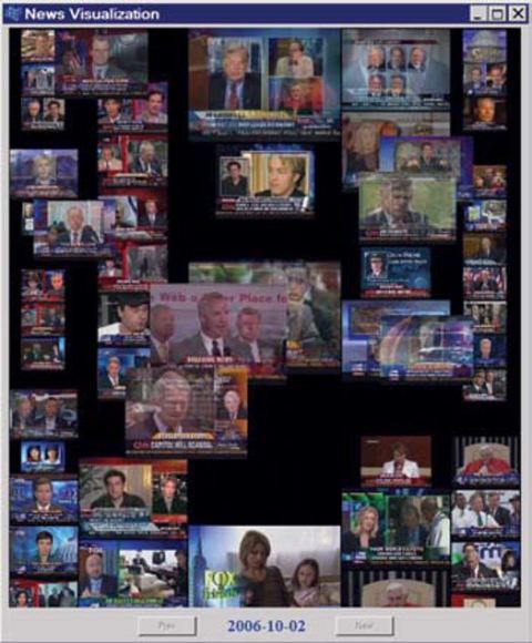
Example: Ordering News Topics by “Interestingness”
Ever want to find out what are the hottest news topics within a given time period? In this visualization, the most reported (hottest) topics are in the center column. Less-reported topics appear in the side columns.

News visualization topics are arranged according to “interestingness” for a given time period. Hottest topics (those most reported) appear in the central column. Side columns are used for topics of lesser impact by the interestingness measure. (Click for credits and source.)
(blank)
Using Information Visualization to Improve Your Publications
For your visualization to be effective, it must be useful to your audience as well as aesthetically appealing. This requires thoughtful analysis, attention to detail, imagination, and no small amount of perseverance. This YouTube video provides some examples and techniques. You may also find inspiration in Edward Tufte’s website.
The idea is that you do the heavy lifting, so your audience doesn’t have to.
To guide your work, ask the following questions:
Does your visualization have a purpose? That is, what is the story you are trying to tell with this visualization? What information are you trying to tease out of the data and put into visual form?
Is your visualization the best one to convey the story? That is, when your audience sees the visualization, will they immediately grasp the “big picture” of your analysis of the data? Will they easily grasp the meaningful patterns in the subject? If details are also important, does your visualization scale to that level in a way that makes sense for the subject and the audience?
Is your visualization interactive? Interactive views allow you to guide the story and are especially helpful when there is too much detail to show all at once. Although interactivity works best online, it can be approximated in print by breaking out information into related visualizations.
Is your visualization beautiful? Beauty influences comprehension. How you present something can determine its usefulness. Visual attributes such as fonts, colors, sizing, orientation of view, scaling of graphic elements and placement of graphic elements have a large impact on the user experience. For an example of WOW! beautiful maps, check out Maps: Visualizing Twitter and Flickr Data.
Tell me, do you think information visualization is the new frontier?
Now it’s your turn: What do you think? Do you use information visualization in your work? Do you generate your designs by software or have a graphic artist create them? I’d really like for you to keep the conversation going by leaving comments. Thanks! Elizabeth Lexleigh LexPower The Write Ideas
